I was moving right along with my first One-Shot, also the first comic book I've done in a year, until something didn't feel right. I couldn't put a finger on it, so I gave myself a couple days to think about what I've done so far.
One thing that popped into my head was I broke a personal rule of mine. Work with in my comfort zone. I'm naturally a doodler when it comes to drawing. I rarely draw faces who's heads measure over an inch in length ( not aspect size, the size I draw them at ). Feeling I was doing myself a disservice by trying to do something I wasn't comfortable with, I thought I solved my lingering concern. But it was only the tip of the iceberg.
I also noticed the comic book in whole doesn't feel right. I got half of it done, and a part of me wants to finish it. But still I feel I missed something, so I went back to the books. As I mentioned before my favorite comics to read are GI Joe and X-Men. However when I draw, I prefer something that looks like a Manga. This is where I found the problem.
My script and style were dictating my overall direction of my story. While I wanted to make something that read like and old school comic book, I was really making something completely different. Now at first I thought this was just me being lazy again and I'll have another failed project on the shelf. However the more I looked into it and analyzed what I was doing, I found I created a conflict between what I wanted to accomplish and what I was actually doing. This conflict eventually over came my progress and made me sit back and actually examine what the problem was.
I couldn't figure it out right away, so I did what I usually do when I'm stuck. Just doodle and read some comic books. After a couple days I looked at what I was doing. When it came to doodling I was concentrating on Bust and Full shots. When I read some comic books I was looking at more Wide and Mid shots. This was the conflict I discovered with in myself.
I wasn't concentrating on what actually made me read the comics I like. Instead I was relying completely off what I practice the most. Thinking I was on to something I decided to use Math ( Oh yeah, Math rules ) to give me a better picture of what I needed to do to keep myself interested in what I'm doing. To do that I broke down the different panels used in 2 comic books I regularly read to see what made them up. The results were surprising.
2 Comic Books for a total of 199 panels.
9% were Close-Ups Shots.
23% were Bust Shots.
10% were Full Shots.
31% were Mid Shots.
27% were Wide Shots.
The One-Shot I was working on told a different story. It's mostly made up of Close-Ups and Bust Shots. With a majority of those Bust Shots mistaken as Mid Shots and with very few Wide Shots. In the end I found my answer to why I stopped working on it, I had an image of what I wanted it to be, but was doing something that wasn't even close to being that. In other words, my sub-conscience shut it down.
Now I was quick to figure I was just being lazy, but everything I've done the past year or so lead me to think this wasn't the case. To explain that I'll take you back to 2 years ago where I decided to take my fandom and hobby to the next level. At first I was all gun-ho about making a comic book. But I ran into a lot of problems off the bat. My depression which lead to me not drawing for nearly 3 years had a strong effect. I couldn't draw men, I forgot how to draw in perspective correctly, and all the other little things took a dive as well. Proportions, hands, faces, anatomy, the list went on.
So before I could draw anything I basically had to teach myself to draw all over again. I also took this opportunity to draw digitally as well. After nearly 2 years of doodling, sketching, reading, and studying I finally became satisfied with what I was doing. However I also felt I wasted time. All those activities created a lot of clutter, clutter I saw that could have been used to make a comic book. All that lead me to the One-Shot process I've put in this blog.
So laziness wasn't an issue. I've had countless days over the last 2 years of doing nothing but drawing for 6-8 hours straight. I would wake up in the morning and just draw as soon as I got my morning coffee. So when I had this urge to stop drawing my One-Shot last week, I knew it had to be something besides being a procrastinator. Something was trying to communicate with me, and by looking what i was doing, how I was doing it, and what I wanted to achieve made me figure out what it is.
For now I shelved my One-Shot, however I can pick it back up if I want to in the future. It might seem like wasted time, but I ended up learning something about myself in that process. If I had just stopped and tried to do another one thinking I was just bored with it and that was that, I wouldn't have come to the conclusion that I was making something I didn't want to make.
Somewhere in between all this lies the connection between the doodler in me and the comic book artist in me. I need to find that connection so I can exploit it to the point where every time I draw, I'm working on a comic book. Because the doodler me can draw and draw 24/7.
So how do I get there? Do I just practice Mid and Wide Shots? Do I change my subject matter? Or is there something else I can do to make the connection easier? For starters I need to ask myself these questions and remember some tips before I embark on anything in the future.
Is this the kind of story I want to tell? If so, is it being told the best way possible?
That might seem vague, but in reality I need a good story. One that leaves me satisfied so I can keep drawing. My One-Shot was a story I wanted to tell. However one reason I stopped was because in the back of my mind, I know it could have been told better. In simpler terms, I'm a hard guy to please even when I'm the one making something.
If I don't want to draw something, don't draw it.
Against my better judgement, I went ahead and added capes to all my Heroes in the One-Shot. I hate capes. Why would I add capes? Exactly. It's not that they're hard to draw, but to me they add unnecessary clutter to a character's design. I had visions of cool poses with them, but that didn't translate too well when it came to the characters interacting in their every day life. For some reason I kept them all stiff and generic for way too many panels. I should have listen to myself, but I didn't. Which is weird since I had the same conversation with myself in the past and opted for no capes. Maybe I wanted a challenge, but for making a One-Shot, I need to keep the challenges to minimum. I need to draw what I'm comfortable drawing.
I don't have to draw everything, use dialog to help with the action. Switch between subjects when necessary.
This is something I didn't catch till about 5 hours ago. I had a whole page that was nothing more than 2 characters getting from where they were to where I wanted them. Actually it was a page an half. In my head I thought " I don't want to draw all these backgrounds". But in reality I was adding an action sequence that was useless. I could have had the characters say " We'll make it over there" then cut back to something else only to show the characters where the needed to be later.In other words I wasted panels, time, and bored myself with a useless action. I should have known better.
Draw with in my comfort zone.
Remember I said I draw small. This is probably a handicap and definitely not an industry standard. But it is how I draw. Anytime I draw subjects bigger than I'm use too, things look weird. Including the pages I uploaded. Now I have 2 options on how to remedy this. I can still make my pages 1/2 larger than the finished sized, but keep my subjects with in my comfort zone and add more panels. Or I could make my pages smaller, even at 1:1 size. Now the second option has limitations. Even I can't draw that small, but to compensate I can do that on a story that has less than 5 panels per page ( I made a mini comic where each page was so small, I could only do 3 pages max ) I could have, and should have done this One-Shot like that, since all my perspective work was going to be done on the computer anyways. But for something that will use more than 5 panels per page, it would have to larger so I could have some various sizes on my subjects with in each panel.
This was something I decided when I was doodling, that the amount of panels per page will dictate the size I can make my comic book at. It will however, only work for me. It's part of that self discovery thing I was taking about.This is just one example of how all artists should review the things they do and how they do them. You might find something about yourself you didn't know.
Conclusion
I don't know what I'll do next. But after studying my work the past few days I've learned more about myself than I would have if I had done nothing at all. I still think the process I laid out for making One-Shots is a perfect example of how to balance writing and drawing to create a sequential piece of art. But as for me I have a split personality. The doodler artist and comic book artist with in me are struggling to find a common ground.
One one side I have the doodler who can draw for hours on end, wishing everything he drew told a story so he could share it with other people. On the other side is the comic book artist who has a story to tell, but can't draw for hours on end because something is holding him back. It really is a conundrum and something I need to address.
Will I find that perfect balance where I can draw for hours on end and tell a story? Am I doomed to doodle for the rest of life without every taking my talent to the next level? I don't know, but I do know that if I want to take myself to the next level, I need to figure out what's going on. It might take days or weeks. Maybe even months and years ( why not, I've wasted enough of my life already )
But I do know this. I have the passion. I have ideas. And I know if I apply myself a little harder I can find that common ground. I can make that connection. I guess I just never asked myself the one question I've always avoided.
How badly do you want it?
Oh so badly. Now to do something about it.
Monday, November 15, 2010
Tuesday, November 9, 2010
Working 1.4 Creative Decisions
I wanted to work on this with the computer, but the eye strain was too much for me to take. So I decided Sunday to do the pencils by hand, leaving the rest to be done on the computer once my eyes take break.
With that I began prepping my pages so they'd be in the same aspect ratio to the reduced size. As a personal rule I work 30% larger than the finished size. So 30% larger than 4.5 x 6.94 will be just enough for me to work on a standard 8.5 x 11 piece of paper.
I used Blue Line Pro paper that I purchased years ago and have been meaning to use it up. So I cut it all in half and used the back side of that paper for my pencils. Personally I'm not too picky about what kind of paper I use to pencil it all out. I was even going to use loose leaf paper just because I have a ton of it sitting around. But I figure since I had a ton of paper sitting around that I paid good money for back when I had money I'd use it up.
In my honest opinion though, if you plan to pencil by hand and scan in your art to do the inking, coloring, and lettering, you can use any kind of paper as long as the aspect ratio of your finished size adds up. A sketchbook will do as well, especially if you're like me and plan to do all your perspective work on the computer.
So here are my 4 pages done so far.


I decided to follow my plan of doing the Introduction and Ending first, since these were the only areas my two Antagonists appear in. I did this to keep some consistency for them when I was drawing it out. But even after two days there were slit differences in each panel. However their main features are pretty consistent.
My main focus was mostly the characters. I already know in my head that effects, SFX, the town in the background, and any other background imagery will be completed using Manga Studio when I ink it. Even at this stage I'm still a little concern of the guys arms in the first and last page. I'll at least be able to use these pencils as a reference I can use later in Manga Studio to make sure it's up to my standards.
I was also a little upset that the paper I used was too thick. Even held up to the light, I could barely make out any flaws when I flipped the page. This is a good technique to use to find errors you may not see looking at it normally. To get any idea I had to use a lot of hard lines even on the sketching phase of it. I didn't like this so by the time I got to page 3 I opted to get an idea, and use Manga Studio to find any flaws.
Next time I'll probably use lighter paper. I don't like doing too much erasing and normally draw really light and then go back over each page with a hard pencil stroke. It's common for me to see all the under sketching in my work when I scan it in.
So far I'm ahead of schedule. I did plan to do a page a day to just ease into it. However I got my second wind after tkaing a break and was able to do an additional page each day. I also worked around my panels and did the easier ones first. Saving the hard ones so I didn't rush them. I especially did this on Page 3 with my Page Breaker panel ( Page Breakers are on all odd pages )
As far as the dialog, I don't add it in now since my handwriting is pretty bad to follow digitally. I just made sure I left enough room for my word balloons. However when I ink these, I'll do the lettering first. That way id I need room I can cutout the content of a panel and resize it in case I didn't leave enough room. Though it's safe to say this comic will come out without that doing that since it isn't dialog heavy.
However that doesn't mean I can't move around each panel as I so desire. It will be up to me as I progress in the later stages. But for now the ground work is 1/4 done. Now to do the other 12 pages.
With that I began prepping my pages so they'd be in the same aspect ratio to the reduced size. As a personal rule I work 30% larger than the finished size. So 30% larger than 4.5 x 6.94 will be just enough for me to work on a standard 8.5 x 11 piece of paper.
I used Blue Line Pro paper that I purchased years ago and have been meaning to use it up. So I cut it all in half and used the back side of that paper for my pencils. Personally I'm not too picky about what kind of paper I use to pencil it all out. I was even going to use loose leaf paper just because I have a ton of it sitting around. But I figure since I had a ton of paper sitting around that I paid good money for back when I had money I'd use it up.
In my honest opinion though, if you plan to pencil by hand and scan in your art to do the inking, coloring, and lettering, you can use any kind of paper as long as the aspect ratio of your finished size adds up. A sketchbook will do as well, especially if you're like me and plan to do all your perspective work on the computer.
So here are my 4 pages done so far.
I decided to follow my plan of doing the Introduction and Ending first, since these were the only areas my two Antagonists appear in. I did this to keep some consistency for them when I was drawing it out. But even after two days there were slit differences in each panel. However their main features are pretty consistent.
My main focus was mostly the characters. I already know in my head that effects, SFX, the town in the background, and any other background imagery will be completed using Manga Studio when I ink it. Even at this stage I'm still a little concern of the guys arms in the first and last page. I'll at least be able to use these pencils as a reference I can use later in Manga Studio to make sure it's up to my standards.
I was also a little upset that the paper I used was too thick. Even held up to the light, I could barely make out any flaws when I flipped the page. This is a good technique to use to find errors you may not see looking at it normally. To get any idea I had to use a lot of hard lines even on the sketching phase of it. I didn't like this so by the time I got to page 3 I opted to get an idea, and use Manga Studio to find any flaws.
Next time I'll probably use lighter paper. I don't like doing too much erasing and normally draw really light and then go back over each page with a hard pencil stroke. It's common for me to see all the under sketching in my work when I scan it in.
So far I'm ahead of schedule. I did plan to do a page a day to just ease into it. However I got my second wind after tkaing a break and was able to do an additional page each day. I also worked around my panels and did the easier ones first. Saving the hard ones so I didn't rush them. I especially did this on Page 3 with my Page Breaker panel ( Page Breakers are on all odd pages )
As far as the dialog, I don't add it in now since my handwriting is pretty bad to follow digitally. I just made sure I left enough room for my word balloons. However when I ink these, I'll do the lettering first. That way id I need room I can cutout the content of a panel and resize it in case I didn't leave enough room. Though it's safe to say this comic will come out without that doing that since it isn't dialog heavy.
However that doesn't mean I can't move around each panel as I so desire. It will be up to me as I progress in the later stages. But for now the ground work is 1/4 done. Now to do the other 12 pages.
Saturday, November 6, 2010
Working 1.3 Manga Studio Prep Work
Now that I have all my thumbnails completed it's time to get started with the rest of the work. My first job will be to import my thumbnails into a story using Manga Studio. The methods I use can also be emulated in other programs, but Manga Studio's soul purpose is comics. And it's full of handy tools to keep myself organized as I work.
I'll start by creating a new story using a page layout I created with specific specs. My thumbnails will fit with in those specs, that once finished will be the same specs Tokyo Pop uses for OELs. I haven't bothered to see if they updated their specs or not, since I don't plan on sending them anything. But it's the specs I've gotten use to using over the years, so to be consistent with what I'll do, I'll stick to them for now.

In Manga Studio I opened a new story with 20 pages ( the reason 20 is because I want those black areas to fill in later for a Cover, Back Cover, and inside flaps in case I want to print out a finished copy later that reads like a real comic book ) With a complete layout of all the pages, I then go one by one and place the thumbnails in the proper order.
Manga Studio saves both the Story and Pages as separate files. Since my computer is really old and slow, working with this many pages open at once, and at 600 dpi really pushed it. It will only get worse when I add my pencils, inks, and everything else. After they are placed in the proper order I save it all and close. Now I can go back and open each page on it own and work from there.

Zoomed in you can see how my thumbnail almost fills up my safety area. It's close enough for what I'll use it for. I also have my pages numbered on the thumbnail so I didn't lose track while importing them. Now that I'm working on one file at a time I can begin penciling over my thumbnails. I'll drop the Opacity of the thumbnail and use the sketch layer to start building up my panels. But before I do that I'll make my panel layer.

Using the panel ruler layer I create my panels. Once finished I Rasterize it and place it over all the other layers. This is a technique you can do in Photoshop as well. Notice how the area of my panels is transparent and the rest is opaque with white. This can easily be done in Photoshop with a separate layer and using either the blending options ( recommended for tinkering ) or the line tool.
Manga Studio also uses Panel Folders. Now I use to think these were great because it made a folder for every single panel, with all it's contents staying with in it. But it created too much clutter for me. Also when I zoom in and out like I do most of the time, it always went to the center of the panel, not to the area I wanted to zoom in on. Some people like them, but I prefer to use as few layers as possible, because it's going to get crazy once I start adding the dialog.

With my panels already determined ( I saved the Ruler Layer in case I want to make changes later ) I'm ready to get into the process of fleshing out my thumbnails. As I progress, the original thumbnails will disappear and my digital pencils will take over. I just roughed this out for now to illustrate the concept of how I'm working on this. I use a variety of pencils presets that I customized to have different opacities so I can build off my basic figures with a light pencil and as I progress move on to darker ones for the detail.
The key to doing this digitally is to not rush it. Use the same methods as you would on paper and take your time. The two panels I did need to be gone over again, but at least I'm getting an idea of what I want, adding and erasing as I got along.
Since I don't plan on using anymore than 2 pens when I ink ( That's what I'd use if I did this traditionally ) I plan to take my time on the pencils to make sure everything is the way I want it. And since this is done in Manga Studio once my pencils are finished, I can Ink and Letter this page before moving on to the next if I so desire.
Manga Studio was made for this kind of work because it's loaded with all sorts of handy tools. Such as perspective rulers and symmetry rulers. You can also quickly flip and rotate your canvas just like I heard you can in the new edition of Photoshop.
For now I just wanted to give a taste of how I go about tackling a comic book page in Manga Studio. The next entry I make will be with it finished. But don't worry, I'll make sure to break that down as well to show you how I got there.
I'll start by creating a new story using a page layout I created with specific specs. My thumbnails will fit with in those specs, that once finished will be the same specs Tokyo Pop uses for OELs. I haven't bothered to see if they updated their specs or not, since I don't plan on sending them anything. But it's the specs I've gotten use to using over the years, so to be consistent with what I'll do, I'll stick to them for now.
In Manga Studio I opened a new story with 20 pages ( the reason 20 is because I want those black areas to fill in later for a Cover, Back Cover, and inside flaps in case I want to print out a finished copy later that reads like a real comic book ) With a complete layout of all the pages, I then go one by one and place the thumbnails in the proper order.
Manga Studio saves both the Story and Pages as separate files. Since my computer is really old and slow, working with this many pages open at once, and at 600 dpi really pushed it. It will only get worse when I add my pencils, inks, and everything else. After they are placed in the proper order I save it all and close. Now I can go back and open each page on it own and work from there.
Zoomed in you can see how my thumbnail almost fills up my safety area. It's close enough for what I'll use it for. I also have my pages numbered on the thumbnail so I didn't lose track while importing them. Now that I'm working on one file at a time I can begin penciling over my thumbnails. I'll drop the Opacity of the thumbnail and use the sketch layer to start building up my panels. But before I do that I'll make my panel layer.
Using the panel ruler layer I create my panels. Once finished I Rasterize it and place it over all the other layers. This is a technique you can do in Photoshop as well. Notice how the area of my panels is transparent and the rest is opaque with white. This can easily be done in Photoshop with a separate layer and using either the blending options ( recommended for tinkering ) or the line tool.
Manga Studio also uses Panel Folders. Now I use to think these were great because it made a folder for every single panel, with all it's contents staying with in it. But it created too much clutter for me. Also when I zoom in and out like I do most of the time, it always went to the center of the panel, not to the area I wanted to zoom in on. Some people like them, but I prefer to use as few layers as possible, because it's going to get crazy once I start adding the dialog.
With my panels already determined ( I saved the Ruler Layer in case I want to make changes later ) I'm ready to get into the process of fleshing out my thumbnails. As I progress, the original thumbnails will disappear and my digital pencils will take over. I just roughed this out for now to illustrate the concept of how I'm working on this. I use a variety of pencils presets that I customized to have different opacities so I can build off my basic figures with a light pencil and as I progress move on to darker ones for the detail.
The key to doing this digitally is to not rush it. Use the same methods as you would on paper and take your time. The two panels I did need to be gone over again, but at least I'm getting an idea of what I want, adding and erasing as I got along.
Since I don't plan on using anymore than 2 pens when I ink ( That's what I'd use if I did this traditionally ) I plan to take my time on the pencils to make sure everything is the way I want it. And since this is done in Manga Studio once my pencils are finished, I can Ink and Letter this page before moving on to the next if I so desire.
Manga Studio was made for this kind of work because it's loaded with all sorts of handy tools. Such as perspective rulers and symmetry rulers. You can also quickly flip and rotate your canvas just like I heard you can in the new edition of Photoshop.
For now I just wanted to give a taste of how I go about tackling a comic book page in Manga Studio. The next entry I make will be with it finished. But don't worry, I'll make sure to break that down as well to show you how I got there.
Working 1.2 Story, Characters, and Thumbnails
This is probably the hardest step in making a One-Shot. Actually coming up with something. Since my last post I spent 2 days thinking about what I wanted to do. I had no idea at the time what that might be. I was leaning towards a modern setting, but decided to bite the bullet and do my fantasy idea I've had sitting for well over a year. Coincidently this was the same idea I failed on last year, but instead of rehashing old story ideas I decided to start from scratch and just use the characters I had on hand.
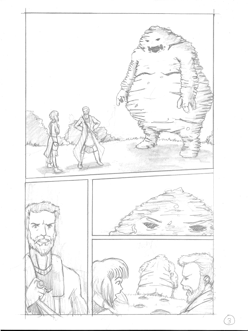
Although coming up with a plot wasn't easy. Since I wanted this to be an action orientated One-Shot I needed some concepts that went beyond Good vs Bad. Using this website, Chaotic Shiney, I saw an idea I haven't thought of and used it. The generator their provided this, " A Geomancer uses a Golem to ravish a town."
From that simple plot idea, I was able to use my characters and make a short story out of it. How did I know this plot would be good? It wasn't the first one that popped up, but it was the first one that sparked something inside of me where I was able to see a whole story evolve from it. Before I even wrote anything down I already had an idea of how many characters I needed, where it will take place, and how it will Climax and End. The Climax and End were important because if I couldn't visualize those two things quickly, then my story would have been doomed from the very start.
Once I was confident this will work for me. I began to write it out in my notebook.

When I said notebook I wasn't kidding. I meant the good old fashion spiral variety. With my simple plot selected I fleshed it out here. I also gave my characters names, listing the ones I'd use, as well as giving myself a schedule on how long I had to get everything done. Once I felt this was good enough for my One-Shot I proceeded to make my character sketches.


My thumbnails might be crude, but as long as I know what's happening in each panel I'm okay. If I was making this story for another artist, I would go back on these to flesh them out more. I tried to keep the figures simple, in some cases just an outline of them with an indication of how their head is orientated by adding circles for eyes or ears.
Another thing to note is before I began. I laid out my Story Structure on Page 1. That was my guide to how the story would play out. Also each page represents each section of the Story Structure. By keeping it separated like that I was able to concentrate on one scene at a time.
Also I was able to work backwards. After I finished my Introduction, I immediately did my Ending. Since the Antagonist's are only on those sections of my One-Shot, when I draw this out I can do my Introduction and Ending first to stay consistent in my artwork when doing the Antagonists. If I went in order, I'd have 12 pages of doing the Protagonists and the Golem, then have to go and draw the Antagonists from the beginning for just one page. The idea here is to be consistent. If I did a comic book that went back in forth between two groups, I'd work on one group first, then the other to stay consistent, even if it's done out of order.
Another thing I did is when it came down to The Problem, Dealing With Problem, and The Climax I worked backwards again ( as mentioned in my tutorial ). Because I know how the scenes began and ended I worked around the whole Pagination Areas so I properly paneled my scenes.
Take The Problem section for instance. I know I had to use pages 4 and 5 to introduce my Protagonists since my Antagonists were in the Introduction. Before I started I knew I wanted the page 7 to end with the Golem marching down the street. That was the first thing I drew, then for my Page Breaker for page 7 I added each character in a surprised reaction to what they're seeing. After that I proceeded to do the other 3 pages.
I started on Page 4 with a wide shoot of the town. Then I knew a conversation would take place, so to end the conversation I had Page 6 start with a villager breaking up the conversation and warning our heroes of the Golem. With those main panels in place I started filling out the rest. I didn't keep what I first chose ( and if you look hard you can see eraser marks ) but by laying down key panels first, how it ends, where it starts, and where it changes, I was able to easily fill out the rest of the pages. This is what I mean in my tutorial about working around your scenes and Pagination Areas to determine your paneling.
Onto the action in the Dealing with Problem and Climax sections. Guns are user friendly when it comes to action. You can use one panel ( wide or whatever ) and the amount of action you want out of the guns depends on how many SFX's you use. Cheap I know, but know this. Hand to hand to combat and any other form of physical actions require a lot of panels. I got off easy because my fantasy story does have guns ( a creative decision made last year ) but I had plans to add some melee weapons in here. That proved to be too much on my page count, so I scrapped it.
However when 2 of my characters go to push the statue off the temple to crush the Golem, that was done in 2 sequences. Them running past the Golem and up the Temple to get to the roof, and then them pushing the Statue over. I also juggled that with the other 2 heroes who went to get bigger guns to slow down the Golem in the right spot so the statue would fall on him. This helped me balance out those 2 separate events happening in the same scene when it came to paneling my pages.
I also started out by doing the last page of the Climax first. Knowing my Ending won't end with our heroes, I needed a moment at the end of the Climax for the Protagonists to celebrate a little. The aftermath being a Page Breaker panel that I will spend more time on than the others.
Where to go from here?
With everything I need to finish my One-Shot completed I have several options. If I was busy ( which I'm not ) I could pack everything together and start another One-Shot project, leaving this one sit until I had the time to complete it. Or I could begin drawing it out. In this case I'll be drawing it out for the sake of the this blog.
Doing that I have 2 routes I could go. I could do this traditionally or digitally. I will do this one in particular digitally with Manga Studio 4. With that option I'm going to take the scans of my thumbnails and place them on each page as a guide to draw out my One-Shot. I could do it traditionally, but for some of the panels I have designed I'll probably rely on the 3D model figures Manga Studio provides. Again the decision is all mine, and any way I decide on how to do this will work, it's just a matter of what I think will work best.
To help me finish this quickly I'm going to keep this in the back of my mind. If I did the maximum panels I was allowed for these 16 pages, that's a possible 128 panels. At 15 minutes a panel that 32 hours. My On-Shot has a total of 67 panels, I think ( I'm not recounting ). That's half of the maximum I will allow myself to do for an average of 4 panels per page. If my math is right that should take 16 hours, give or take, to pencil this out.
Add another 16 hours for inking, dialog, and colors/tones and I should have this done in a week. The only thing that could hold me back is if I get too creative in the art ( work outside my comfort zone ) or if I have eye and hand sprains. ( I'm known to sprain my hand a lot and I use a CRT monitor that just kills my eyes ) Either way if I treat this like a job, I should have no problem finishing this up if I work on it 6 hours a day. Just below full-time at a real job.
The Story, Characters, and Thumbnails are the hardest part of any One-Shot. With that out of the way I can concentrate on just drawing it up with no distractions or second guessing where my One-Shot is going. I already know how it will play out, now it's up to me to finish it up so people can read it.
Although coming up with a plot wasn't easy. Since I wanted this to be an action orientated One-Shot I needed some concepts that went beyond Good vs Bad. Using this website, Chaotic Shiney, I saw an idea I haven't thought of and used it. The generator their provided this, " A Geomancer uses a Golem to ravish a town."
From that simple plot idea, I was able to use my characters and make a short story out of it. How did I know this plot would be good? It wasn't the first one that popped up, but it was the first one that sparked something inside of me where I was able to see a whole story evolve from it. Before I even wrote anything down I already had an idea of how many characters I needed, where it will take place, and how it will Climax and End. The Climax and End were important because if I couldn't visualize those two things quickly, then my story would have been doomed from the very start.
Once I was confident this will work for me. I began to write it out in my notebook.
When I said notebook I wasn't kidding. I meant the good old fashion spiral variety. With my simple plot selected I fleshed it out here. I also gave my characters names, listing the ones I'd use, as well as giving myself a schedule on how long I had to get everything done. Once I felt this was good enough for my One-Shot I proceeded to make my character sketches.


To make these I used a home-made stencil I crafted from a blank stencil you can purchase at any craft store. The stencil was built off an ordinary pose that I drew, then cut out in certain sections so I could quickly put a body on the paper and add in the face and costumes on top of it. I highly recommend blank stencils to any artist out there who knows they are going to use a repeated process over and over again. These can be used for any type of project you can think of. Word Balloons, Page Templates, and even your own handwriting.
The character designs I decided to go with were my 3rd designs. Even though this is a fantasy with guns, I wanted it to seem somewhat more fantasy like and went with a tunic/cape design on my heroes as opposed to a full body suit/pants design I came up with first. I didn't want it to seem too fantasy like, hence the guns, but I didn't want to give the impression this was too modern. I had to balance it out.
With my characters in place I began to do the thumbnail using the Thumbnail Worksheet I made in my previous entry.
My thumbnails might be crude, but as long as I know what's happening in each panel I'm okay. If I was making this story for another artist, I would go back on these to flesh them out more. I tried to keep the figures simple, in some cases just an outline of them with an indication of how their head is orientated by adding circles for eyes or ears.
Another thing to note is before I began. I laid out my Story Structure on Page 1. That was my guide to how the story would play out. Also each page represents each section of the Story Structure. By keeping it separated like that I was able to concentrate on one scene at a time.
Also I was able to work backwards. After I finished my Introduction, I immediately did my Ending. Since the Antagonist's are only on those sections of my One-Shot, when I draw this out I can do my Introduction and Ending first to stay consistent in my artwork when doing the Antagonists. If I went in order, I'd have 12 pages of doing the Protagonists and the Golem, then have to go and draw the Antagonists from the beginning for just one page. The idea here is to be consistent. If I did a comic book that went back in forth between two groups, I'd work on one group first, then the other to stay consistent, even if it's done out of order.
Another thing I did is when it came down to The Problem, Dealing With Problem, and The Climax I worked backwards again ( as mentioned in my tutorial ). Because I know how the scenes began and ended I worked around the whole Pagination Areas so I properly paneled my scenes.
Take The Problem section for instance. I know I had to use pages 4 and 5 to introduce my Protagonists since my Antagonists were in the Introduction. Before I started I knew I wanted the page 7 to end with the Golem marching down the street. That was the first thing I drew, then for my Page Breaker for page 7 I added each character in a surprised reaction to what they're seeing. After that I proceeded to do the other 3 pages.
I started on Page 4 with a wide shoot of the town. Then I knew a conversation would take place, so to end the conversation I had Page 6 start with a villager breaking up the conversation and warning our heroes of the Golem. With those main panels in place I started filling out the rest. I didn't keep what I first chose ( and if you look hard you can see eraser marks ) but by laying down key panels first, how it ends, where it starts, and where it changes, I was able to easily fill out the rest of the pages. This is what I mean in my tutorial about working around your scenes and Pagination Areas to determine your paneling.
Onto the action in the Dealing with Problem and Climax sections. Guns are user friendly when it comes to action. You can use one panel ( wide or whatever ) and the amount of action you want out of the guns depends on how many SFX's you use. Cheap I know, but know this. Hand to hand to combat and any other form of physical actions require a lot of panels. I got off easy because my fantasy story does have guns ( a creative decision made last year ) but I had plans to add some melee weapons in here. That proved to be too much on my page count, so I scrapped it.
However when 2 of my characters go to push the statue off the temple to crush the Golem, that was done in 2 sequences. Them running past the Golem and up the Temple to get to the roof, and then them pushing the Statue over. I also juggled that with the other 2 heroes who went to get bigger guns to slow down the Golem in the right spot so the statue would fall on him. This helped me balance out those 2 separate events happening in the same scene when it came to paneling my pages.
I also started out by doing the last page of the Climax first. Knowing my Ending won't end with our heroes, I needed a moment at the end of the Climax for the Protagonists to celebrate a little. The aftermath being a Page Breaker panel that I will spend more time on than the others.
Where to go from here?
With everything I need to finish my One-Shot completed I have several options. If I was busy ( which I'm not ) I could pack everything together and start another One-Shot project, leaving this one sit until I had the time to complete it. Or I could begin drawing it out. In this case I'll be drawing it out for the sake of the this blog.
Doing that I have 2 routes I could go. I could do this traditionally or digitally. I will do this one in particular digitally with Manga Studio 4. With that option I'm going to take the scans of my thumbnails and place them on each page as a guide to draw out my One-Shot. I could do it traditionally, but for some of the panels I have designed I'll probably rely on the 3D model figures Manga Studio provides. Again the decision is all mine, and any way I decide on how to do this will work, it's just a matter of what I think will work best.
To help me finish this quickly I'm going to keep this in the back of my mind. If I did the maximum panels I was allowed for these 16 pages, that's a possible 128 panels. At 15 minutes a panel that 32 hours. My On-Shot has a total of 67 panels, I think ( I'm not recounting ). That's half of the maximum I will allow myself to do for an average of 4 panels per page. If my math is right that should take 16 hours, give or take, to pencil this out.
Add another 16 hours for inking, dialog, and colors/tones and I should have this done in a week. The only thing that could hold me back is if I get too creative in the art ( work outside my comfort zone ) or if I have eye and hand sprains. ( I'm known to sprain my hand a lot and I use a CRT monitor that just kills my eyes ) Either way if I treat this like a job, I should have no problem finishing this up if I work on it 6 hours a day. Just below full-time at a real job.
The Story, Characters, and Thumbnails are the hardest part of any One-Shot. With that out of the way I can concentrate on just drawing it up with no distractions or second guessing where my One-Shot is going. I already know how it will play out, now it's up to me to finish it up so people can read it.
Sunday, October 31, 2010
Working 1.1 One Shot Thumbnail Worksheet
Before I begin coming up something for my One-Shot I need to be organized right off the bat. I also need room for all the information I'm going to need to make my One-Shot.
Using Photoshop I made myself some sheets to keep everything in place. This is what all 5 pages look like. Click Here to Download the PDF file from my DA page

Using Photoshop I made myself some sheets to keep everything in place. This is what all 5 pages look like. Click Here to Download the PDF file from my DA page
As you can see, I've organized my thumbnails so my pagination stays true to how the reader will turn the page. The first and last page are by themselves while all the other pages are connected in the way it will be read. This will also help me if I plan to do any Two-Page-Spreads.
The first page has an area for me to fill in my Story Structure for the entire One-Shot. I've also left a huge area for me to add notes and sketches on the last page to help me flesh it out more before I start adding images to all the pages. In that area I can add my cast of characters, make sketches of them, and also sketch out some locations I'll be using in my One-Shot.
If you're a natural doodler like me, than half a page is more than enough room to jot down some quick ideas.
Once I have everything I need to know about whats going on in the One-Shot, I'll proceed to thumbnail the panels for each page. I'll also be writing down my script as I go along with that process on a separate piece of paper. Making sure I identify the dialog with each page and panel represented in my thumbnails. After that is all finished I can review my work, make sure I didn't leave any plot holes, and change things if I want.
Then it will be a matter of preference on my part. If I decide to pencil it out traditionally, I'll use these thumbnails as a guide and draw out my comic on separate pieces of paper that will 1.5 larger than the finished size. If I decide to do this all digitally, I'll scan in my thumbnails as separate images, import them into the page file I have for making a digital comic book, and have the thumbnail for each page in the background with the opacity reduced so I could draw over it.
No matter which path I decide to take, the thumbnails will be the blueprint I'll follow when I'm drawing out. In other words, I need all my attention at this stage so I don't pencil half of my One-Shot and decide to change something mid-stream.
Time Management
In my guide I mentioned a little something about time management. If I spend a good week, two to six hours a day, working on my thumbnails, that should be more than enough time to flesh out the story, add dialog, and get the pages to look like the way I want them too all before I start drawing it out.
I also mention that if I follow the rule of no more than 8 panels per page, that leaves me with a maximum of 128 panels total for the whole One-Shot. I won't have that many panels, but if I spend 15 minutes drawing each panel, that gives me 32 hours to pencil out my One-Shot. That will be another week.
The last week will be all the finishing up. Inking, Coloring or Toning, and adding the Dialog. A total of 3 weeks to make a One-Shot from scratch. It's realistic and doable. But only if I make sure the thumbnails are what I want before I begin.
The thumbnail stage is the most crucial part of the whole process. That where I'll not only sketch out what the pages will look like, but write the story out at the same time. A perfect balance of writing and drawing. If I'm not sure everything is up to spec at that stage, I could find myself having half of my One-Shot penciled only to discover my story falls flat in one part, or my ending doesn't make sense. I don't want to do that.
I want to make sure my thumbnails are done correctly so I can rely heavily on artistic talent to finish up the grunt work that will follow. Any changes I make to my One-Shot after the thumbnail stage will cost me time, and time is something I don't want to waste.
Like I said before, the more One-Shots I make, the better I'll get at making them. That won't happen if I constantly go back and forth and change things to my characters, story, or the overall sequence of the scenes when I'm already penciling it. In other words I'm committed to my thumbnails once I start penciling. That will be the point of no return.
This is the tablet I used in making my thumbnail worksheets. Although it isn't it the best Wacom tablet out there, it's sort of the middle ground version. It's more advance then the Bamboo, and just as powerful as some of their more expensive models.
If your a traditional artist who wants to start going digital, this is probably the best tablet to start out with. Although the initial price is rather high, I took a chance and bought it. Keep in mind there is a learning when you start drawing completely on the computer. It took me about a year to get the hang of it, but it was a year well worth spent.
A tablet won't automatically make your work better, it's pretty much just like drawing on paper only with a different feeling to it. So don't buy one thinking your work will improve. Buy one if you want to fully utilize the extra tools digital work has for you. Also if you want to reduce the clutter around your workspace and save money on art supplies in the future.
Saturday, October 30, 2010
2.4 Mini Conclusion, and the Here After
So I've uploaded my One-Shot Structure that I wrote over the past 7 months. Since all the information provided in it was found from various sources, many of which I mentioned and contain far more information than I'm willing to share, this is provided a no cost to you.
Personally I got enough How To Draw Books to choke a horse. And you probably do as well.
I'm a pretty simple person, and everything I posted before will be the simple tools I'll use to create my own One-Shot. I feel awkward explaining how I'm going to do it without actually doing one yet. Believe me I've been debating on that. But I figure if I shoot the gun and post it all it will inspire me to actually make something with the process I put in place.
And that's where this blog will be headed in the future. Any One-Shot or comic I make from here on out will be posted here in stages, so other amateurs can see the process in action. And any new information I learn along the way will also be added as time goes on. And any constructive criticisms or questions will be handled with. I will take the time to answer any questions, and even add more information to my previous posts if someone feels like I missed something.
As I embark on this new journey of satisfying my lifelong dream I'll leave you this. Whether you're talented or not, I think anyone can make a comic book. I think every individual in the world has a story to tell or an imagination to share. Art is not an activity that should only be enjoyed by an elite few. It's an exercise everyone should take part in so they could learn more about the world around and most importantly themselves.
If you have doubts about yourself, throw them out the window. All you need is passion and a little help from others who share that same passion. That was the purpose of this Blog. In the end I hope it does help someone out there just as it's helped me.
So sketch, create, write, and enjoy doing what you love best. I know I will.
This is an esential read. Also be sure to check out Scott's website to explore other ideas and exercises. Like the 24 hour comic.
Even if you prefer manga, this book is old school. It's full of the basics to get the ball rolling.
Even more old school. This is a must have book to learn how to create Sequential Art. Even the pros use this book.
There are a ton of How to Draw Manga Books, but this one is the complete package. It covers everything one will need to know to get started. Highly recommended.
2.3 Positive and Negative Space
The last thing we need to learn is Positive and Negative space. Most people treat this as a per panel rule, but for what we’re trying to accomplish I feel it’s something that needs to be utilized on the entire Pagination Area. While we’re thumbnailing our One-shot we’ll keep in mind the positive and negative space as we go along. This will include both backgrounds and black fills.
This will help us getting a better understanding of what the finished product will look like, no matter if you plan to color or tone your One-Shot, or if you’re doing western or manga style. Some people will talk to death about this subject and make claims like “ Pro don’t mess this up “. The reason why pros don’t mess this up is because it’s so simple to do. You could screw it up, but even so it will still be effective. The best way I found about managing Positive and Negative space without killing myself over it was in How to Draw Comics the Marvel Way. Now I’m going to be a little harsh here, but it doesn’t matter if you’re doing a manga, that book as a lot of useful information in it.
Their way of managing Positive and Negative space came down to one simple guideline. Direct the reader into seeing what you want them to see. The easiest way for us to do that is to manage our backgrounds and black fills. When we ink our One-Shot we will use different thickness’s of pen strokes to create a field of depth and variety to our lined work. But we’ll also add backgrounds to show the reader where our characters are, and black fills to help direct the reader’s eyes into seeing what we want them to see.
How we handle small and large panels will also help the reader. Same goes for the flow and the designs for each panel. So when we manage our backgrounds and black fills to our panels in each Pagination Area, we have to make sure we highlight what we want the reader to be focused on in each one.
Lets take a look at an example of a Pagination Area I penciled a year ago. Keep in mind this was a One-Shot that I failed to finish. Despite not finishing that One-Shot, the pages I had done lead me to make this tutorial. I knew something was working in this, but I didn’t know what it was until now. So lets take a look at it.


As you can see this is a pretty standard penciled drawing of a Pagination Area. I have a total of 9 panels spread across it. Out of those 9 panels, only 4 contain backgrounds. I didn’t know it at the time, but by only having 4 panels with backgrounds I was creating balance. Another thing I didn’t know I was doing was using a variety of panel designs between each panel. Even though I have Close-ups occupying the middle of both pages, each one uses a different composition or is slightly different from the next one.
I did all of this not really understanding what I was doing, I was just going through the motions. Even though it looks flat and boring, this is just the pencils. The next step will be to highlight what we want the reader to see in each panel. This will create Positive and Negative space that will help direct the reader even more. So lets see how this will look with a little bit of ink on it.
 

With an ink outline it still looks flat. Even so I decided to add a little help in directing the reader. Notice the bottom gutters of the first panels on both pages. I added a little angle to them in this step to direct the reader. However page 2’s first panel is angled in the wrong direction. It makes you jump from that panel on to the 3rd one. That’s another powerful tool we can use to help the reader. Even though it’s angle isn’t much, our eyes are directed to the wrong panel completely missing the one we should go to.
One page 3 the first panel’s bottom gutter is angled in the correct direction and leads us to the right panel. I try to keep angled panels to a minimum, one maybe two a page. If I wanted this done correctly, I would have had the top gutter on the bottom panel of page 2 angled to direct the reader to the first panel of page 3. A helpful little tool to keep the reader on that Pagination Are without getting lost.
Besides that bad angle on page 2. I have the right idea in directing the reader through this Pagination Area with my choice in panel designs, but I’m going to need a little help. That’s where backgrounds and black fills come in. Those areas are where we’ll manage the Positive and Negative space, and there really isn’t much too it. It’s mostly about managing our black fills. We have two choices on how to accomplish this.
We could either add more black to the backgrounds, making the lightness of the characters stand out. Or we could add more black to the characters, making them standout from the lightness of the backgrounds. Either one will suffice and accomplish the same thing. Help direct the reader. We can also swap where add more black between each panel to create more variety. Whichever one we chose, we need more black added to this Pagination Area.
The simple reason is this. If we can’t tell what’s going on in the images without color, then we didn’t successfully manage our Positive and Negative space. If this was colored right now, we would have a better idea of what’s going on, but we still won’t be focused on the most important parts of each panel. It will still look flat and boring.
By using black fills and creating a little bit of depth, we will successful keep the reader focused on the important parts. So lets add some more black ( but not too much )

Well maybe I used too much, but by using a black fills in or around the characters of each panel I pretty much circled what I wanted the reader to see in each panel without doing exactly that. I also used it sparingly. Some people will say “ Use more black to create a gloomy comic,” but in reality we have to keep in mind that colors and tones will also help us balance that out. Those too will be determine the mood we want to give our comic book when it’s nearly finished.
What we want to accomplish by using black fills is to balance our Positive and Negative space and highlight the points of interest in each panel. We can add black to them like I did in most of it. Or add black around them like I did in the first panel on page 3. Either way we want the reader to be directed to the most important thing with in those borders. And overall you want to use it sparingly so our Pagination Area as a perfect balance of Positive and Negative space. Remember the Traditional Composition method? Try to manage your blacks in 1/3rd’s. For this example I’d say that the whole Pagination Area is 1/3rd black, 2/3rd white.
Now the last panel is one that can be done either way. I decided to add more black to the characters to make them standout, but I also could have added more black to the background. Let’s see how that would look.
 

By making the grassy hill they are laying on more black then the characters, I’ve made the them standout more. They’d standout even more if the background had a line width that was less then the line width used on the characters. However I did add more black to the tree line to illustrate that they were looking down on a little valley. By swapping the use of my thick black fills I’ve made that panel look more different than the last panel on the previous page. I’ve also created a better balance of black on the Pagination Area itself.
This is a trick that’s commonly used by most artists. It’s also a cheap way to make anything you do stand out more. Common places it’s used is around characters faces, mostly around the face in either the hair or the shadow under the chin. Entire bodies when they want the figure to stand out more compared to the background. Or in the background to make the character standout in a scene that could be taking place at night or in a dimly lightened area.
Managing this as we do our thumbnails will give us a better idea of how we’re directing the reader, and how our key points of interest in each panel that we want displayed. Although these examples take it to the extreme ( I’d probably never fill that hill in with all black ) there are ways of breaking it so it doesn’t look like we just colored in an area with black.
The best way to get better at this is to remember the basics and of course practice, but if I had stopped at just adding ink lines to these pages, the reader wouldn’t really know what to look at in each panel. The whole Pagination Area would look neutral and they would be totally dependant on the dialog to help them through it.
By laying down some thick areas of black we’re helping the reader see what’s happening in each panel without having to rely on colors or tones. Probably the best example of doing this was done by Frank Miller in his Sin City series. Although in that he took it to a whole new level, those books alone show how a creator can direct the reader through whole book by properly managing the Positive and Negative space without he use of colors or tones.
Backgrounds
I wanted to talk about this separately because this was a topic that always bothered me. I use to think backgrounds we necessary in every panel. However I’ve come to realize this isn’t true. Like I showed in those previous pages, I used a background in 4 of the 9 panels. That is, so far. There are also special effect backgrounds I could add to the other panels to portray a mood or an emotion. A technique that’s commonly used in mangas.
I guess what I’m trying to say is backgrounds that show a location shouldn’t be overused. They’re critical for Mid and Wide shots, but when it comes to the other panels shots there are alternatives like the ones I just mentioned. Another thing to note is the backgrounds shouldn’t overshadow the points of interest in each panel.
This holds true for special effect backgrounds. They should be subtle compare to the points of interest, or be managed with black fills. Location backgrounds don’t have to be in great detail, and should be drawn with a thinner line than what was used on the characters. The idea behind this all is this, a reader will focus on the points of interest of each panel while everything else is just filler to them.
In reality a reader will get a glance of a panel, read the dialog, and move on to the next. This gives us the creators an advantage. We don’t have to sit and concentrate all our efforts to making the best looking backgrounds. If the characters fit in the background correctly and it offers just enough information for the reader then the mission is accomplished.
So if you’re worried that it doesn’t look good, don’t be. Our overall goal is get the reader from panel to panel, page to page. And we can make it as simple or as complex as we want too. Don’t worry about what other people are doing, just concentrate on your own abilities and do the best job you can do. You never know, you might even surprise yourself at some point down the road.
But it’s a road nonetheless, not a teleporter that will magically get you from point A to B.
This is an esential read. Also be sure to check out Scott's website to explore other ideas and exercises. Like the 24 hour comic.
Even if you prefer manga, this book is old school. It's full of the basics to get the ball rolling.
Even more old school. This is a must have book to learn how to create Sequential Art. Even the pros use this book.
There are a ton of How to Draw Manga Books, but this one is the complete package. It covers everything one will need to know to get started. Highly recommended.
This will help us getting a better understanding of what the finished product will look like, no matter if you plan to color or tone your One-Shot, or if you’re doing western or manga style. Some people will talk to death about this subject and make claims like “ Pro don’t mess this up “. The reason why pros don’t mess this up is because it’s so simple to do. You could screw it up, but even so it will still be effective. The best way I found about managing Positive and Negative space without killing myself over it was in How to Draw Comics the Marvel Way. Now I’m going to be a little harsh here, but it doesn’t matter if you’re doing a manga, that book as a lot of useful information in it.
Their way of managing Positive and Negative space came down to one simple guideline. Direct the reader into seeing what you want them to see. The easiest way for us to do that is to manage our backgrounds and black fills. When we ink our One-Shot we will use different thickness’s of pen strokes to create a field of depth and variety to our lined work. But we’ll also add backgrounds to show the reader where our characters are, and black fills to help direct the reader’s eyes into seeing what we want them to see.
How we handle small and large panels will also help the reader. Same goes for the flow and the designs for each panel. So when we manage our backgrounds and black fills to our panels in each Pagination Area, we have to make sure we highlight what we want the reader to be focused on in each one.
Lets take a look at an example of a Pagination Area I penciled a year ago. Keep in mind this was a One-Shot that I failed to finish. Despite not finishing that One-Shot, the pages I had done lead me to make this tutorial. I knew something was working in this, but I didn’t know what it was until now. So lets take a look at it.

As you can see this is a pretty standard penciled drawing of a Pagination Area. I have a total of 9 panels spread across it. Out of those 9 panels, only 4 contain backgrounds. I didn’t know it at the time, but by only having 4 panels with backgrounds I was creating balance. Another thing I didn’t know I was doing was using a variety of panel designs between each panel. Even though I have Close-ups occupying the middle of both pages, each one uses a different composition or is slightly different from the next one.
I did all of this not really understanding what I was doing, I was just going through the motions. Even though it looks flat and boring, this is just the pencils. The next step will be to highlight what we want the reader to see in each panel. This will create Positive and Negative space that will help direct the reader even more. So lets see how this will look with a little bit of ink on it.
With an ink outline it still looks flat. Even so I decided to add a little help in directing the reader. Notice the bottom gutters of the first panels on both pages. I added a little angle to them in this step to direct the reader. However page 2’s first panel is angled in the wrong direction. It makes you jump from that panel on to the 3rd one. That’s another powerful tool we can use to help the reader. Even though it’s angle isn’t much, our eyes are directed to the wrong panel completely missing the one we should go to.
One page 3 the first panel’s bottom gutter is angled in the correct direction and leads us to the right panel. I try to keep angled panels to a minimum, one maybe two a page. If I wanted this done correctly, I would have had the top gutter on the bottom panel of page 2 angled to direct the reader to the first panel of page 3. A helpful little tool to keep the reader on that Pagination Are without getting lost.
Besides that bad angle on page 2. I have the right idea in directing the reader through this Pagination Area with my choice in panel designs, but I’m going to need a little help. That’s where backgrounds and black fills come in. Those areas are where we’ll manage the Positive and Negative space, and there really isn’t much too it. It’s mostly about managing our black fills. We have two choices on how to accomplish this.
We could either add more black to the backgrounds, making the lightness of the characters stand out. Or we could add more black to the characters, making them standout from the lightness of the backgrounds. Either one will suffice and accomplish the same thing. Help direct the reader. We can also swap where add more black between each panel to create more variety. Whichever one we chose, we need more black added to this Pagination Area.
The simple reason is this. If we can’t tell what’s going on in the images without color, then we didn’t successfully manage our Positive and Negative space. If this was colored right now, we would have a better idea of what’s going on, but we still won’t be focused on the most important parts of each panel. It will still look flat and boring.
By using black fills and creating a little bit of depth, we will successful keep the reader focused on the important parts. So lets add some more black ( but not too much )

Well maybe I used too much, but by using a black fills in or around the characters of each panel I pretty much circled what I wanted the reader to see in each panel without doing exactly that. I also used it sparingly. Some people will say “ Use more black to create a gloomy comic,” but in reality we have to keep in mind that colors and tones will also help us balance that out. Those too will be determine the mood we want to give our comic book when it’s nearly finished.
What we want to accomplish by using black fills is to balance our Positive and Negative space and highlight the points of interest in each panel. We can add black to them like I did in most of it. Or add black around them like I did in the first panel on page 3. Either way we want the reader to be directed to the most important thing with in those borders. And overall you want to use it sparingly so our Pagination Area as a perfect balance of Positive and Negative space. Remember the Traditional Composition method? Try to manage your blacks in 1/3rd’s. For this example I’d say that the whole Pagination Area is 1/3rd black, 2/3rd white.
Now the last panel is one that can be done either way. I decided to add more black to the characters to make them standout, but I also could have added more black to the background. Let’s see how that would look.

By making the grassy hill they are laying on more black then the characters, I’ve made the them standout more. They’d standout even more if the background had a line width that was less then the line width used on the characters. However I did add more black to the tree line to illustrate that they were looking down on a little valley. By swapping the use of my thick black fills I’ve made that panel look more different than the last panel on the previous page. I’ve also created a better balance of black on the Pagination Area itself.
This is a trick that’s commonly used by most artists. It’s also a cheap way to make anything you do stand out more. Common places it’s used is around characters faces, mostly around the face in either the hair or the shadow under the chin. Entire bodies when they want the figure to stand out more compared to the background. Or in the background to make the character standout in a scene that could be taking place at night or in a dimly lightened area.
Managing this as we do our thumbnails will give us a better idea of how we’re directing the reader, and how our key points of interest in each panel that we want displayed. Although these examples take it to the extreme ( I’d probably never fill that hill in with all black ) there are ways of breaking it so it doesn’t look like we just colored in an area with black.
The best way to get better at this is to remember the basics and of course practice, but if I had stopped at just adding ink lines to these pages, the reader wouldn’t really know what to look at in each panel. The whole Pagination Area would look neutral and they would be totally dependant on the dialog to help them through it.
By laying down some thick areas of black we’re helping the reader see what’s happening in each panel without having to rely on colors or tones. Probably the best example of doing this was done by Frank Miller in his Sin City series. Although in that he took it to a whole new level, those books alone show how a creator can direct the reader through whole book by properly managing the Positive and Negative space without he use of colors or tones.
Backgrounds
I wanted to talk about this separately because this was a topic that always bothered me. I use to think backgrounds we necessary in every panel. However I’ve come to realize this isn’t true. Like I showed in those previous pages, I used a background in 4 of the 9 panels. That is, so far. There are also special effect backgrounds I could add to the other panels to portray a mood or an emotion. A technique that’s commonly used in mangas.
I guess what I’m trying to say is backgrounds that show a location shouldn’t be overused. They’re critical for Mid and Wide shots, but when it comes to the other panels shots there are alternatives like the ones I just mentioned. Another thing to note is the backgrounds shouldn’t overshadow the points of interest in each panel.
This holds true for special effect backgrounds. They should be subtle compare to the points of interest, or be managed with black fills. Location backgrounds don’t have to be in great detail, and should be drawn with a thinner line than what was used on the characters. The idea behind this all is this, a reader will focus on the points of interest of each panel while everything else is just filler to them.
In reality a reader will get a glance of a panel, read the dialog, and move on to the next. This gives us the creators an advantage. We don’t have to sit and concentrate all our efforts to making the best looking backgrounds. If the characters fit in the background correctly and it offers just enough information for the reader then the mission is accomplished.
So if you’re worried that it doesn’t look good, don’t be. Our overall goal is get the reader from panel to panel, page to page. And we can make it as simple or as complex as we want too. Don’t worry about what other people are doing, just concentrate on your own abilities and do the best job you can do. You never know, you might even surprise yourself at some point down the road.
But it’s a road nonetheless, not a teleporter that will magically get you from point A to B.
This is an esential read. Also be sure to check out Scott's website to explore other ideas and exercises. Like the 24 hour comic.
Even if you prefer manga, this book is old school. It's full of the basics to get the ball rolling.
Even more old school. This is a must have book to learn how to create Sequential Art. Even the pros use this book.
There are a ton of How to Draw Manga Books, but this one is the complete package. It covers everything one will need to know to get started. Highly recommended.
2.2 Paneling the Pages
Paneling the pages can be as complex or as simple as we want them to be. So before we get started I’m going to show an example that standard 6 panel layout I mentioned before.
 

As you can see I’m using pages 2 and 3. The reason for this is because those two pages are a Pagination Area ( remember that? ). The Pagination Area was used in our story layout to help provide scene changes and locations of our story sections. They will also be used together when laying out our panels. The reason for this is because we need to treat each Pagination Area as a small story. It will contain a beginning, middle, and end. In the old days of comic books each page was treated this way. But back then comic books were full of ads, and two page spreads were pretty rare until the 80‘s.
By treating each page as it’s own little story it was easier for the printers to add advertising without worrying about the reader getting confused. Each page contained enough information for the reader to stay on track. One artist who was best known for his one page panel layouts was Jack Kirby. However as comic books grew over the years, so did the page layouts.
That basic 6 panel layout might seem boring by today’s standards, but even if you do your entire comic book like this it’s still acceptable. It might not be flashy, but it’s still a good way to layout your pages and tell a story. Bone is one of my favorite comic books off all time and this basic layout occupies a majority of its pages. The reason I’m showing this layout is because it’s a good place to start before we get real fancy since we also have to know how a comic book is read and which direction it should flow for the reader.
 

As you can see the reader will start at the top left and zigzag from left to right until he/she reaches the end of the page. From there they continue on the next page from the top left making there way to the bottom. This is in just about every How To Book you can find, but I figure I should mention it here because it will effect how we lay out our panels. We still don’t have enough information to actually free ourselves from the basic 6 panel layout, but by understanding the flow of the pages we can use our angles and composition to keep the reader on the page.
Now we’ll begin the real work. By using our story layout process from earlier, we will use both the dialog and artwork to determine the size of each panel. Before we do that there is one handy little tool we can use to help us fill this Pagination Area up with panels. I found this little tidbit in How To Draw Manga Vol 3. It was neatly tucked away in-between all the previous information I just told you about paneling. They didn’t spend much time on it, nor did they have a name for it. They just knew that this was most important part of laying out the panels. I call it the Page Breaker.
The Page Breaker is the first panel the reader sees in every Pagination Area before any other panel when they turn the page. This is the one area of each Pagination Area that needs to be focused on the most. And logically, it is where you’ll start each area as well. Remember how I said back in the Story Layout that we started with the Climax and Ending first? Well we’re going to do something like that with each Pagination Area. And once you know where the Page Breaker is you’ll see what I mean.
 

The Page Breaker takes up the top half of every second page in each Pagination Area. Our One-Shot comic book will have a total of 7 of them. The reason the Page Breaker is somewhat important is because every time the reader flips the page, that area of the next two pages is the first area they’ll see. They don’t know it’s the first thing they’ll see, but it’s in the back of their mind. If our best panels and best artwork occupy those 7 areas in our One-Shot, we could leave a good impression on the reader. But if it’s phoned in art wise and not at all exciting they could bored.
Now the Page Breaker doesn’t have to be one huge panel taking up that area, it can be divided up in a series of panels that make up an action, or even take up 2/3rds or the entire page. The most important thing to remember is you want to get the reader’s subconscious attention when they turn the page, using that area of the page to do so. And we only have to do it 7 times in our 16 page One-Shot.
Since we’re going to be treating each Pagination Area as a small story, consider the Page Breaker as the Climax for that area. It will be the first thing we work on for each Pagination Area. Next we’ll work on the beginning and ending of that area. Just like we did with our story structure. We’ll be working around the whole Pagination Area first before filling in the detail.
 

With these 3 areas worked on first, we now have an outline of how to fill up the rest of it. Think of it as if you were drawing a person. The Beginning being the head of that person, the Page Breaker the body, and the Ending where the feet will end up. That’s what we’re doing, building an outline structure so we’ll have a properly proportioned Pagination Area.
Now that we got an idea of how this area will be laid out, we can start adding in the other panels. This is where we rely on our story to tell us how to make the rest of the panels. And it’s not as hard as it sounds. Before we fill in the rest of the area we have to remember a few simple rules. And trust me these aren’t hard to remember. Knowing them will help us determine not only what kind of panels to use, but how to lay them out. And in the end we’ll find ourselves breaking free of that basic 6 panel layout.
Those are the rules we’ll use. Not only to fill in the rest of our panels, but also for the Page Breaker, Beginning, and Ending panels as well. To get a better understanding on how we use those rules I’ll go into more detail about each one. First we have to know what I mean by large and small panels. Remember the picture that showed the basic 6 panel page layout? Each panel in that picture is an average sized panel. Anything smaller than that will be a small panel, anything larger will be a large panel. That will be our guide for determining the size of our panels.
Let’s start with small panels. Small panels are perfect for characters engaged in conversations or action sequences. In conversations we’ll keep in mind rule #3 to help us along the way. We don’t want to use too much dialog. For example if we have a panel that contains nearly 35 words of dialog, that will probably take up 2/3rds of the panel. That is a lot of words to cram into one panel, so when we’re doing our thumbnails and using dialog to dictate the artwork we’ll keep in mind the word limit to help us judge the composition we‘ll use for that panel. Otherwise we could end up with too many small panels full of word balloons. When a reader sees a wall of text ahead of them, they’ll probably close the book early ( I‘ve done this as well ) we don’t want that to happen.
An action sequence will be a series of small panels that lead up to a large panel for the high point. They can average in 2 to 3 panels in length and will have an animation like feeling to them. They can also be tapered starting from a small panel, to an average one for the second action, and ending with the conclusion of that action in a large panel.
Its one thing to consider when we thumbnail our One-Shot and decide to illustrate a big action sequence. If we made all the panels in an action sequence large, the end of the action won’t be as dramatic as the series of events that led up to it. That’s why it’s best to use small panels or a variety of sizes leaving the large panels for the final action. It gives the reader a kind of payoff that in the end will leave them satisfied.
That brings us to large panels. These should be used to illustrate high points in our story. Examples would be the result of a conversation, a scene change, a setting change, or the final result of an action. If we want we can start a page with a large panel to set the tone for the rest of the Pagination Area without adding any more large panels. Or we can end on a large panel to make everything that happened in that Pagination Area feel more dramatic on its conclusion. Either way large panels are there for us to create a certain mood or tension. They are used to reward the reader for reading a series of small panels, or give them a taste of something even more dramatic yet to come when they turn the page.
The word limit is actually pretty generous. I’ve tried, and filling 20-25 words per balloon is a challenge for me. Even more so with the panel limit of 30-35. The idea with that rule is to make sure we don’t exceed those limits making our pages look like a wall of text, something the reader doesn’t want. We need that balance of artwork and dialog to keep them interested in our One-Shot. And too much of either one of those could tune them out. So when we start working on our thumbnails we’ll keep that in mind so we’re not concentrating on one aspect more than the other. We want an equal balance of both dialog and artwork.
Panel Designs are the combination of a panel shot, panel angle, and panel composition. Just as we have to make sure we don’t repeat ourselves in the dialog part of our One-Shot, we also can’t repeat ourselves in the artwork. An example would be two panels next to each other that both use a close-up shot, a mid angle, and a traditional composition that has the subject taking up 2/3rds of the panel. To mix it up we only have to switch one thing. Say we still want it to be a close-up with a mid angle shot. We could just change the composition to having the subject take up 1/3rd of the panel then 2/3rd‘s in the next. Or use a Triangle composition instead. All we know is we don’t want to have identical looking panels sitting right next to each other.
Some artist can get away with this, but for an amateur who’s just starting out, it’s best to use variety between each panel to keep them from looking boring. It helps keep the reader interested and that’s what we want to accomplish. If all our panels had identical designs it will look like we didn’t put any effort into our One-Shot at all.
With these simple rules to go off of we’ll start seeing ourselves coming up with a variety of page designs, each one different from the other. The reason that happens is because we’re using our story to determine our art for our One-Shot. After a while we’ll see that every new project we start will look different from each other because of the difference in stories. Despite the fact we’ll use the same structure when laying out our 5 story sections for every One-Shot we make.
This is an esential read. Also be sure to check out Scott's website to explore other ideas and exercises. Like the 24 hour comic.
Even if you prefer manga, this book is old school. It's full of the basics to get the ball rolling.
Even more old school. This is a must have book to learn how to create Sequential Art. Even the pros use this book.
There are a ton of How to Draw Manga Books, but this one is the complete package. It covers everything one will need to know to get started. Highly recommended.

As you can see I’m using pages 2 and 3. The reason for this is because those two pages are a Pagination Area ( remember that? ). The Pagination Area was used in our story layout to help provide scene changes and locations of our story sections. They will also be used together when laying out our panels. The reason for this is because we need to treat each Pagination Area as a small story. It will contain a beginning, middle, and end. In the old days of comic books each page was treated this way. But back then comic books were full of ads, and two page spreads were pretty rare until the 80‘s.
By treating each page as it’s own little story it was easier for the printers to add advertising without worrying about the reader getting confused. Each page contained enough information for the reader to stay on track. One artist who was best known for his one page panel layouts was Jack Kirby. However as comic books grew over the years, so did the page layouts.
That basic 6 panel layout might seem boring by today’s standards, but even if you do your entire comic book like this it’s still acceptable. It might not be flashy, but it’s still a good way to layout your pages and tell a story. Bone is one of my favorite comic books off all time and this basic layout occupies a majority of its pages. The reason I’m showing this layout is because it’s a good place to start before we get real fancy since we also have to know how a comic book is read and which direction it should flow for the reader.

As you can see the reader will start at the top left and zigzag from left to right until he/she reaches the end of the page. From there they continue on the next page from the top left making there way to the bottom. This is in just about every How To Book you can find, but I figure I should mention it here because it will effect how we lay out our panels. We still don’t have enough information to actually free ourselves from the basic 6 panel layout, but by understanding the flow of the pages we can use our angles and composition to keep the reader on the page.
Now we’ll begin the real work. By using our story layout process from earlier, we will use both the dialog and artwork to determine the size of each panel. Before we do that there is one handy little tool we can use to help us fill this Pagination Area up with panels. I found this little tidbit in How To Draw Manga Vol 3. It was neatly tucked away in-between all the previous information I just told you about paneling. They didn’t spend much time on it, nor did they have a name for it. They just knew that this was most important part of laying out the panels. I call it the Page Breaker.
The Page Breaker is the first panel the reader sees in every Pagination Area before any other panel when they turn the page. This is the one area of each Pagination Area that needs to be focused on the most. And logically, it is where you’ll start each area as well. Remember how I said back in the Story Layout that we started with the Climax and Ending first? Well we’re going to do something like that with each Pagination Area. And once you know where the Page Breaker is you’ll see what I mean.

The Page Breaker takes up the top half of every second page in each Pagination Area. Our One-Shot comic book will have a total of 7 of them. The reason the Page Breaker is somewhat important is because every time the reader flips the page, that area of the next two pages is the first area they’ll see. They don’t know it’s the first thing they’ll see, but it’s in the back of their mind. If our best panels and best artwork occupy those 7 areas in our One-Shot, we could leave a good impression on the reader. But if it’s phoned in art wise and not at all exciting they could bored.
Now the Page Breaker doesn’t have to be one huge panel taking up that area, it can be divided up in a series of panels that make up an action, or even take up 2/3rds or the entire page. The most important thing to remember is you want to get the reader’s subconscious attention when they turn the page, using that area of the page to do so. And we only have to do it 7 times in our 16 page One-Shot.
Since we’re going to be treating each Pagination Area as a small story, consider the Page Breaker as the Climax for that area. It will be the first thing we work on for each Pagination Area. Next we’ll work on the beginning and ending of that area. Just like we did with our story structure. We’ll be working around the whole Pagination Area first before filling in the detail.

With these 3 areas worked on first, we now have an outline of how to fill up the rest of it. Think of it as if you were drawing a person. The Beginning being the head of that person, the Page Breaker the body, and the Ending where the feet will end up. That’s what we’re doing, building an outline structure so we’ll have a properly proportioned Pagination Area.
Now that we got an idea of how this area will be laid out, we can start adding in the other panels. This is where we rely on our story to tell us how to make the rest of the panels. And it’s not as hard as it sounds. Before we fill in the rest of the area we have to remember a few simple rules. And trust me these aren’t hard to remember. Knowing them will help us determine not only what kind of panels to use, but how to lay them out. And in the end we’ll find ourselves breaking free of that basic 6 panel layout.
- Use small panels for conversations and action sequences.
- Use large panels for high points, not mundane ones.
- Use 20-25 words per word balloon, 30-35 per panel. Don’t repeat dialog.
- Don’t use the same Panel Design in two panels that are next to each other.
Those are the rules we’ll use. Not only to fill in the rest of our panels, but also for the Page Breaker, Beginning, and Ending panels as well. To get a better understanding on how we use those rules I’ll go into more detail about each one. First we have to know what I mean by large and small panels. Remember the picture that showed the basic 6 panel page layout? Each panel in that picture is an average sized panel. Anything smaller than that will be a small panel, anything larger will be a large panel. That will be our guide for determining the size of our panels.
Let’s start with small panels. Small panels are perfect for characters engaged in conversations or action sequences. In conversations we’ll keep in mind rule #3 to help us along the way. We don’t want to use too much dialog. For example if we have a panel that contains nearly 35 words of dialog, that will probably take up 2/3rds of the panel. That is a lot of words to cram into one panel, so when we’re doing our thumbnails and using dialog to dictate the artwork we’ll keep in mind the word limit to help us judge the composition we‘ll use for that panel. Otherwise we could end up with too many small panels full of word balloons. When a reader sees a wall of text ahead of them, they’ll probably close the book early ( I‘ve done this as well ) we don’t want that to happen.
An action sequence will be a series of small panels that lead up to a large panel for the high point. They can average in 2 to 3 panels in length and will have an animation like feeling to them. They can also be tapered starting from a small panel, to an average one for the second action, and ending with the conclusion of that action in a large panel.
Its one thing to consider when we thumbnail our One-Shot and decide to illustrate a big action sequence. If we made all the panels in an action sequence large, the end of the action won’t be as dramatic as the series of events that led up to it. That’s why it’s best to use small panels or a variety of sizes leaving the large panels for the final action. It gives the reader a kind of payoff that in the end will leave them satisfied.
That brings us to large panels. These should be used to illustrate high points in our story. Examples would be the result of a conversation, a scene change, a setting change, or the final result of an action. If we want we can start a page with a large panel to set the tone for the rest of the Pagination Area without adding any more large panels. Or we can end on a large panel to make everything that happened in that Pagination Area feel more dramatic on its conclusion. Either way large panels are there for us to create a certain mood or tension. They are used to reward the reader for reading a series of small panels, or give them a taste of something even more dramatic yet to come when they turn the page.
The word limit is actually pretty generous. I’ve tried, and filling 20-25 words per balloon is a challenge for me. Even more so with the panel limit of 30-35. The idea with that rule is to make sure we don’t exceed those limits making our pages look like a wall of text, something the reader doesn’t want. We need that balance of artwork and dialog to keep them interested in our One-Shot. And too much of either one of those could tune them out. So when we start working on our thumbnails we’ll keep that in mind so we’re not concentrating on one aspect more than the other. We want an equal balance of both dialog and artwork.
Panel Designs are the combination of a panel shot, panel angle, and panel composition. Just as we have to make sure we don’t repeat ourselves in the dialog part of our One-Shot, we also can’t repeat ourselves in the artwork. An example would be two panels next to each other that both use a close-up shot, a mid angle, and a traditional composition that has the subject taking up 2/3rds of the panel. To mix it up we only have to switch one thing. Say we still want it to be a close-up with a mid angle shot. We could just change the composition to having the subject take up 1/3rd of the panel then 2/3rd‘s in the next. Or use a Triangle composition instead. All we know is we don’t want to have identical looking panels sitting right next to each other.
Some artist can get away with this, but for an amateur who’s just starting out, it’s best to use variety between each panel to keep them from looking boring. It helps keep the reader interested and that’s what we want to accomplish. If all our panels had identical designs it will look like we didn’t put any effort into our One-Shot at all.
With these simple rules to go off of we’ll start seeing ourselves coming up with a variety of page designs, each one different from the other. The reason that happens is because we’re using our story to determine our art for our One-Shot. After a while we’ll see that every new project we start will look different from each other because of the difference in stories. Despite the fact we’ll use the same structure when laying out our 5 story sections for every One-Shot we make.
This is an esential read. Also be sure to check out Scott's website to explore other ideas and exercises. Like the 24 hour comic.
Even if you prefer manga, this book is old school. It's full of the basics to get the ball rolling.
Even more old school. This is a must have book to learn how to create Sequential Art. Even the pros use this book.
There are a ton of How to Draw Manga Books, but this one is the complete package. It covers everything one will need to know to get started. Highly recommended.
2.1 Paneling Angles and Composition
The first step to providing variety in all our panels is knowing the Panel Angles. These should be thought of as the position of the camera as if we were shooting a movie. There are all sorts of positions we could put our camera angle at, but in the end there is only 3 we need to know.
Low Angle
A Worms eye view. This will be a angle looking up at the subject or subjects
Middle Angle
Eye level. This will be an angle where the subject or subjects are looking straight at you
High Angle
Birds eye view. This will be an angle looking down on the subject or subjects.
The Panel Angles don’t just help us with creating variety in our panels. They can also be used to help direct the reader from panel to panel which I will get to later when we start piecing it all together. Even though I only listed 3 types of Panel Angles, each one also has it’s own extremes. By knowing this we could provide an isometric Mid shot from above to show all the characters present in a scene, or a 3-Point-Perspective angle from the ground looking upward to show enormous buildings in a Wide shot. By knowing the 3 basic Panel Angles first, we already have an understanding of how we can build off them creating even more Panel Angles.
The next step in providing variety is Composition. This will help use properly place our characters and dialog inside each panel. I spoke earlier how thumbnailing needs to integrate both writing and drawing. Well it all begins with the Composition of each panel. So let’s see the 2 basic methods of composition we’ll have at our disposal.
 

With these basic methods of composition we have an idea of how to properly juggle both subjects and dialog with in our panels. One rule is to never focus too much on the center of panel.
With the Triangle Composition we can place one subject on one point, leaving the other two points free for dialog. Or we can have subjects take up two points leaving just one point for dialog. All while keeping the clutter away form the center of the panel.
The same method can be used for the Traditional Composition. We could use 2/3rd for a subject and use the other 1/3rd left over for dialog, or vice-versa. The theory behind Composition in general is to distribute the contents of the panel in an uneven manner. If we cut a panel in half and only used one half for dialog and the other for the subject, it will be boring. It will also be boring if our subject occupied the precise center of the panel. The idea is to distribute the space to it looks interesting, and a way to do that is in 3rd’s.
Composition will give our panels variety between them. If we use a Traditional Composition on one panel, we could use the Triangle Composition on the next one, and so forth. This variety not only helps us lay out our thumbnails, but provides different images to the reader keeping them interested. After all most of our comics will contain people. Without different ways to present them to the reader without repeating ourselves our One-Shot will look boring.
By knowing the 5 Panel Shots, 3 Panel Angles, and 2 methods of Composition we have a whole variety of panels to use throughout our comic book by simply mixing and matching between all those categories. This is the first step to learning how to build off these basics to make more advance or extreme panels. However for now this is all we need to know to make a comic book that will stand out.
With that we can move on to the next subject, laying them out together. This is where the real work comes in. And where we’ll work off both our drawing abilities and our writing to make sure we are properly placing the panels on our pages. There is also a little trick involved to make sure we keep the reader involved.
Low Angle
A Worms eye view. This will be a angle looking up at the subject or subjects
Middle Angle
Eye level. This will be an angle where the subject or subjects are looking straight at you
High Angle
Birds eye view. This will be an angle looking down on the subject or subjects.
The Panel Angles don’t just help us with creating variety in our panels. They can also be used to help direct the reader from panel to panel which I will get to later when we start piecing it all together. Even though I only listed 3 types of Panel Angles, each one also has it’s own extremes. By knowing this we could provide an isometric Mid shot from above to show all the characters present in a scene, or a 3-Point-Perspective angle from the ground looking upward to show enormous buildings in a Wide shot. By knowing the 3 basic Panel Angles first, we already have an understanding of how we can build off them creating even more Panel Angles.
The next step in providing variety is Composition. This will help use properly place our characters and dialog inside each panel. I spoke earlier how thumbnailing needs to integrate both writing and drawing. Well it all begins with the Composition of each panel. So let’s see the 2 basic methods of composition we’ll have at our disposal.

With these basic methods of composition we have an idea of how to properly juggle both subjects and dialog with in our panels. One rule is to never focus too much on the center of panel.
With the Triangle Composition we can place one subject on one point, leaving the other two points free for dialog. Or we can have subjects take up two points leaving just one point for dialog. All while keeping the clutter away form the center of the panel.
The same method can be used for the Traditional Composition. We could use 2/3rd for a subject and use the other 1/3rd left over for dialog, or vice-versa. The theory behind Composition in general is to distribute the contents of the panel in an uneven manner. If we cut a panel in half and only used one half for dialog and the other for the subject, it will be boring. It will also be boring if our subject occupied the precise center of the panel. The idea is to distribute the space to it looks interesting, and a way to do that is in 3rd’s.
Composition will give our panels variety between them. If we use a Traditional Composition on one panel, we could use the Triangle Composition on the next one, and so forth. This variety not only helps us lay out our thumbnails, but provides different images to the reader keeping them interested. After all most of our comics will contain people. Without different ways to present them to the reader without repeating ourselves our One-Shot will look boring.
By knowing the 5 Panel Shots, 3 Panel Angles, and 2 methods of Composition we have a whole variety of panels to use throughout our comic book by simply mixing and matching between all those categories. This is the first step to learning how to build off these basics to make more advance or extreme panels. However for now this is all we need to know to make a comic book that will stand out.
With that we can move on to the next subject, laying them out together. This is where the real work comes in. And where we’ll work off both our drawing abilities and our writing to make sure we are properly placing the panels on our pages. There is also a little trick involved to make sure we keep the reader involved.
2.0 Paneling Introduction and the 5 Panel Shots
Introduction
This is the next step we need to learn before we do our thumbnails. Now there’s a lot of information on the web about paneling comic books. And most of it is amateurish nonsense by people who have no idea what they‘re talking about. There is such a thing as “ too much information”. Simply throwing out so much information for people can have a negative effect by making any creator a Nervous Nelly. I’ve read a lot of tutorials and How To Books on the subject. But I also did another thing, I’ve read a lot of comic books in my time. My conclusion is this, paneling is as simple and complex as we make it out to be.
To understand how to properly panel our pages we need to learn the history of paneling. For decades the standard 6 even squares on both pages was the standard. In fact it’s still used today. I know many of us might find that boring, but consider this. The layout of the panels isn’t nearly as important as what we put in them.
I mentioned earlier that one of our goals is to make sure we get the reader to read our entire book. Having a simple panel layout will help us achieve that goal. If we go too complex with angled panel borders, characters jumping out of panels, and bleeding off the pages we run the risk of making it look too busy. Even if we have less than 8 panels per page.
As with any medium, whatever is popular is emulated at that time. I consider extreme panel layouts to the shaky-cam technique used in movies and TV shows of the last 5 years. Much like how lens-flares were all the rage back in the 90’s. Those extreme panel layouts that litter comic books and manga today, they’re a fad. At the heart of any project we start we need to keep the readers attention. The more simple we keep our story and panel layouts, the better our odds are that people will read the whole thing. But that doesn’t mean we have to tone it down.
There are simple techniques we can use to ensure that every panel is just as exciting as the most extreme panel layouts we see in today‘s comics, yet modest enough to keep the reader clued in on what’s happening. Just like with our story structure we’ll have several simple guides in place to help us along the way. The overall goal here is balance. On one hand we want our panels to look exciting, but we also don’t want them to be too confusing. By learning the basics of what makes the panels work together, and what all goes inside them, we can carefully layout our panels that will help direct reader.
So let us begin.
The 5 Panel Shots, yup, Only 5
You’ve probably been frustrated with paneling in the past. So much so that you’ve downloaded preset pages, read countless books on the subject, or even read some tutorial that throws in so much information that you end up lost. I’ve found the best way to tackle paneling is to dissect the process of what makes up the panels. Once you know the basics, you can go on to bigger and extreme things later on. But for now, let’s just focus on the minimum that we need to know. The first thing we need to know is there are only 5 different panel shots.


These are the 5 shots that will help us fill out our pages. Each shot has a specific purpose, or job to them. Knowing those jobs will allow us to layout out thumbnails much easier. Before we begin let’s get one thing straight, all these panel shots can be any size we want them to be. The size of the panel has nothing to do with the shot it uses. We’ll determine the size of our panels by using our story, but we’ll touch on that later. Right now let’s get a better understanding of the 5 Panel Shots.
We’ll start with the Close-up. The Close-up is used to express a character’s emotions or for key points of interest related to the story. The contents of it must fall in those two category’s. For instance a character could have just finished up a conversation with another character and begins crying. The Close-up can be used to show their tears. A key point of interest could be an action or an action performed on an object. Such as a shot of an object that’s critical to the story, or an action a character is performing such as shaking another character’s hand.
The Bust shot is of a character from the chest up. This is the most common panel shot we’ll use when we have characters engaged with both conversations and actions. It’s also a utility panel shot, which means it works as a great panel to use in-between others to create variety for the reader. This will be the panel shot we’ll probably use the most, especially in a dialog heavy story.
The Mid shot is mostly used to help the reader determine what the characters are doing, where they are, and even what time of day it is. This is mostly used at the beginning of scenes. In theory we could use one Mid Shot at the beginning of scene and not use another one until the next scene. That’s how powerful the Mid shot is. If done correctly, the reader will think the next 2 or three pages of Bust and Close-ups are still taking place in the same setting. That is, until we use another Mid shot to change locations or actions.
The Full shot contains a person or persons whole body. This is a great panel to use for action scenes. Especially at the end of an action scene. By having a panel with a characters entire body you can create the illusion of movement. It can also be used for dramatic purposes or to introduce a new character in our story. Full shots will help break the mold of the Mid, Bust, and Close-up shots and should be used sparingly to create tension or drama for the reader. When they see a Full shot, they know something is going down.
The Wide shot is a different version of the Mid shot. It does all the same things that the Mid shot does, only it specifies on the setting and time of day. You can still put characters in a Wide shot, but it’s mostly used when doing a story that contains different locations. The Wide shot is also used at the beginning of scenes, but can also be used to end scene. Thus transitioning to another Wide shot on the next scene. All panels are meant to help the reader get from page 1 to page 16, but proper use of the Wide shot will help make that even easier.
Now that we know the 5 Panel Shots, we need to understand how to use them. We need to provide variety for the reader so our panels don‘t all look a like. For that we go into Composition, and this is the probably the biggest key element to not only making panels, but creating a variety of them to keep the reader entertained. Even if we decide to go with the standard 6 panel layout.
This is an esential read. Also be sure to check out Scott's website to explore other ideas and exercises. Like the 24 hour comic.
Even if you prefer manga, this book is old school. It's full of the basics to get the ball rolling.
Even more old school. This is a must have book to learn how to create Sequential Art. Even the pros use this book.
There are a ton of How to Draw Manga Books, but this one is the complete package. It covers everything one will need to know to get started. Highly recommended.
Subscribe to:
Posts (Atom)